Want to see how myCloud Media can help your business?
Thank you for contacting us.
We will reply to you in the next 24-48 hours.

Digital marketing expert Spinx has outlined some of the basic things marketers should know about responsive website design and also shed light on the underlying concepts that support its key role in the website building process in today's multi-device environment.
In this age of technology, a website is often a consumer's first point of contact with a brand. First impressions can be lasting and no marketer would want a potential customer's first interaction with their company to be impaired by poor user experience.
A consumer may decide to use a number of devices to engage with a brand - a desktop computer, a tablet, a mobile phone, a TV set or even more than one of them at the same time. In fact, nine in ten people switch between devices to achieve a particular goal, Google has found. Embracing responsive design is the right path to follow when the aim is to boost engagement and conversion, since it will ensure that your website renders well on any device to deliver the proper output for the consumers' screen size, resolution and platform.
With responsive design, a company can be sure that its website offers an optimal viewing experience across a multitude of devices. Responsive sites employ one URL, one standard set of content and one source code, which can also be beneficial to SEO by making it easier for search engines to crawl and index content.
Responsive design is gradually becoming a go-to technique for marketers seeking to retain their competitive advantage as a growing number of consumers use various devices to go online. Having a site built responsively can help a brand enhance customer loyalty as 61% of people admit they have a better opinion of a brand that delivers a good mobile experience, according to Latitude.
Google, meanwhile, has found that 57% of users would think twice before recommending a company with a poorly designed mobile site to friends. Responsive web design is quoted as being Google's recommended configuration.
Responsive design techniques can be applied to any device and can even help future-proof a website because it can quickly adjust to devices that haven't even been developed yet.
The mobile web is growing bigger and bigger and statistics suggest that providing a mobile-friendly experience does make a difference to users. Those yet to embrace responsive design should also know that it can be more cost effective than building a separate site and an app, for instance, and responsive design is easy to manage as content can be updated through a single content management system (CMS).
LA based digital marketing agency, Spinx Digital have created a superb infographic that explains more.
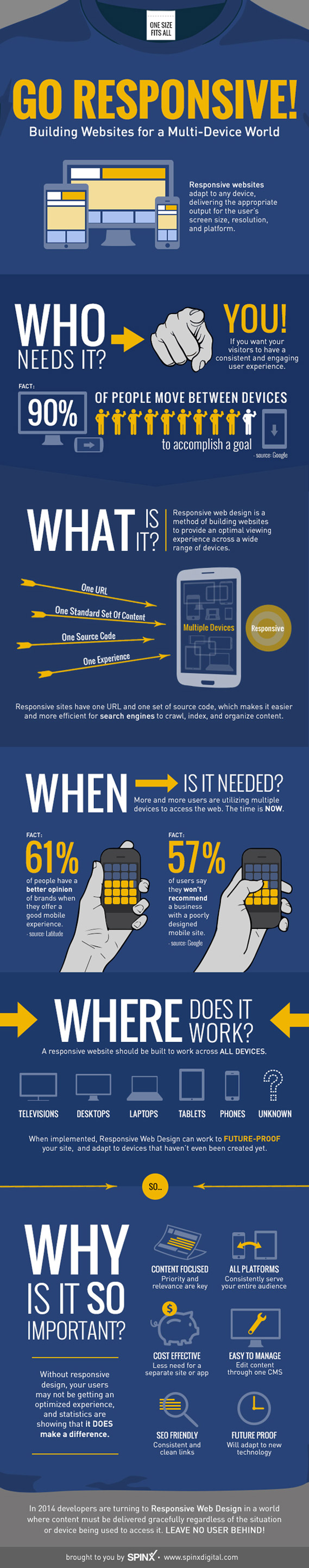
Courtesy of: Spinx Digital
Article by : Tim Bennett
myCloud Media | Yorkshire Web Designers


Thank you for contacting us.
We will reply to you in the next 24-48 hours.
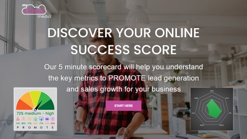
Discover Your Online Success Score
We have teamed up with ScoreApp to launch our new ONLINE SUCCESS scorecard. Designed to let you understand the key metrics to PROMOTE lead generation and sales growth for your business.
How to be an Effective Digital Content Creator with the Help of AI Tools
We all want to be effective digital content creators, don’t we? AI tools might just be the answer, but we still need a people-centric approach when developing our content marketing strategies.

POSITIONING Your Brand, Products Or Services To Solve Customers' Problems
No matter what industry you operate in, building influence and driving revenue always begins in the same way: by positioning your organisation or brand as a solution to your audience’s problem.
How do you REACH out and build relationships with new customers?
We say "people buy from people". But we specifically buy from people and companies we know, like and trust. Building familiarity with the right potential customers takes time, however, you can use a few key tried and tested digital strategies to reach your audience in quick and measurable ways.

Why The Right OFFERS Nurture The Right Marketing and Sales Leads
‘If you build it, they will come.’ That’s how the old saying goes. But in the land of lead generation and growth marketing, it doesn’t quite ring true, does it?

To MOTIVATE your Audience, the Cogs in the Sales Process Must Always be Turning
Optimising your digital efforts to attract and engage audiences is a great way to get them where they need to be: your website.
OPTIMISE for Success... Know What your Customer Wants and Understand What Works
Understanding the buyer journey is key to creating great campaigns that your prospective customers should – in theory – love.

How to TARGET your Ideal Customers for Retention and Repeat Sales
Marketing? Check. Conversion? Check. Sales? Check.
At this point in the game – when a customer commits and purchases a product or service – many organisations pat themselves on the back for a job well done.
How to Turn Customers into Advocates... It’s all About ENGAGEMENT
For those businesses that engage effectively with their customers following a sale, they could be transforming buyers into advocates.